14.1 How to compile a Sass file to a CSS one at the command line
Sometimes you just want to see what your SCSS will look like as CSS. If you have Dart Sass installed (if not, and you’re on a Mac, I recommend brew install sass), you can run the following from the command line:
Using the Sass & selector is actually quite easy, but it’s mildly annoying to look up (given it’s an ampersand). So, I’m stashing some notes and resources on it here.
If you’re new to the notion of nesting, Richard Finelli’s The Sass Ampersand(2017) gives a handy, quick overview. You use & to nest when you want your selection to have both the parent (surrounding) class and the inner child class. To use one of Finelli’s example, the following two SCSS statements are equivalent:
SCSS
// basic nesting.parent {.child {}}// nesting with &.parent {&.child {}}
The above statements translate to the same CSS:
CSS
.parent.child {}
Using & with pseudo classes
My primary use case for & is with pseudo classes, primarily those related to links and buttons (e.g. :hover, or :focus). For example, I use the following code to style links that are direct children of the .citation class and add additional properties and values when they are hovered or focused:
SCSS
.citation>a {&:hover {}&:focus-visible {}}
The second & statement refers to its parent (.citation>a) and is not a descendant of the previous one. So, my generated CSS will have styles for the following:
14.3 How to include one class in another (@extend)
Sometimes you have an element that you want to style with the properties of another class and give it some more properties of its own. Both Quarto and Bootstrap make heavy use of something called the BEM (Block, Element, Modifier) methodology to do this (for example, inspect the HTML for Quarto’s callout blocks), which involves a lot of markup where you have to apply parent and modifier classes to an element.
There are a couple of ways to do this with Sass, the simplest of which is to use @extend. How does it work? As the Sass docs describe:
@extend updates style rules that contain the extended selector so that they contain the extending selector as well.
So, if an element is styled with the extender, it’s also styled as if it matches the class that’s being extended. This means you don’t need to apply both classes to an element in order for the parent-class properties to be applied (as you can see in the CSS generated from the SCSS, below).
Like extends, Sass mixins (@mixin) let you define styles for re-use in your style sheet. Mixins are a bit more advanced than extends, since they can take arguments, allowing you to configure the styles. In the event that you don’t need such configuration, they still work a bit differently. With mixins you declare a group of declarations that are reused when invoked with @include. The styles are, in effect, copied to the current rule, but there is none of the “intelligent unification” that you get with extends—you’re effectively just copying a chunk of styles.
14.4 How to set a text color based on the background color
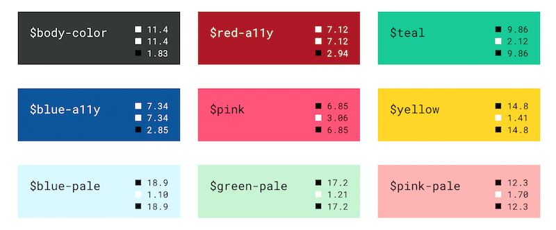
The goal here was to decide if I wanted the foreground color (i.e. the color of the text) to be black or white, based on the background color. I wanted to do this in order to recreate a chart of color shades similar to that used in the Bootstrap-colors documentation.
My initial approach was just to manually set the color property manually for each shade, e.g.:
However, you can actually do this with a Sass @function!
In Kevin Powell‘s Dynamic text color with Sass(2018), he takes the following approach. Write a function, text-clr() that takes a color as an argument, and then use Sass’ built-in lightness($color) function in an @if/@else rule block to decide whether or not the text color should be white or black.
Powell describes his code (which follows):
“…what I’ve told it to do is spit out black if my lightness is greater than 50, and spit out white if my lightness is less than 50.”
To actually use this function, you’d set a background color ($bg), and then apply it like so:
SCSS
body {background: $bg;color: text-clr($bg);}
Powell then goes on to use one of my favorite Sass features, @mixins, to make things even easier (i.e. avoid having to write out the same colour twice).
SCSS
@mixindc($color) {// dc is short for dynamic colorbackground: $color;color: text-clr($color);}
Now you can achieve the same rendered CSS as before by using the dc() mixin with @include:
SCSS
body {@includedc($bg);}
So, with the function and mixin added, the same code I shared at the beginning now looks like this:
I wanted to create color swatches showing contrast ratios in the same way done in the Bootstrap 5.1 docs on colors. In order to do so, you use a color Sass map, like those included in Bootstrap’s variables, e.g. the built-in $colors Sass map is:
Maps in Sass hold pairs of keys and values, and make it easy to look up a value by its corresponding key. They’re written (<expression>: <expression>, <expression>: <expression>). The expression before the : is the key, and the expression after is the value associated with that key.
The @each rule makes it easy to emit styles or evaluate code for each element of a list or each pair in a map. It’s great for repetitive styles that only have a few variations between them. It’s usually written @each <variable> in <expression> { ... }, where the expression returns a list.
You can expand the code below to see the loop used to generate color swatches for each item in the $colors map (originally from the Bootstrap docs source code).
Using the code above with a custom-color map (with the color-contrast() function built into Bootstrap 5.1), I was able to generate swatches showing the contrast for the background color against the current color (i.e. the text/foreground color), against white, and against black.