6 Accessibility
6.1 Accessible Color Generator
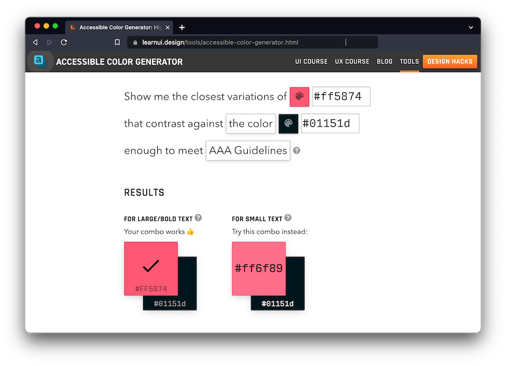
Accessible Color Generator from Learn UI Design is basically the answer to, “use this color but make it accessible!” I don’t know what the magic under the hood is, but it’s my go-to especially when I want to make a Level-AAA variant (i.e. contrast ratio of 7:1 for small text) of an existing color scheme. You just give it the foreground and background colors you’re using, and it spits out the combinations that work for AA or AAA (depending on what setting you choose) for large and small text. I also really like that the UI copies the hex code for a color when you click on the swatch.
6.2 APCA Contrast Calculator
There are tons of contrast calculators out there that will help you pass the Web Content Accessibility Guidelines (WCAG) 2.1 contrast criterion, but there’s one problem: It turns out that the way WCAG requirements calculate contrast is low-key wrong.
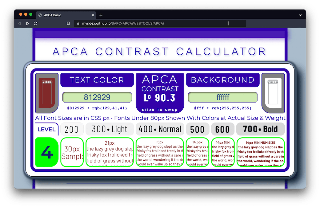
Enter the Accessible Perceptual Contrast Algorithm (APCA) by Andrew Somers (aka Myndex on GitHub). The details of how APCA works are in its GitHub repo. Lisa Charlotte Muth’s writeup on the differences between WCAG and APCA contrast requirements, It’s time for a more sophisticated color contrast check for data visualizations, is also a helpful explainer.
Putting definitions and details aside, though, the important thing to know is that Somers has made a useful tool, APCA Contrast Calculator, where you can put your colors to the test1.
If you want to learn more about APCA (which is slated for use in WCAG 3.0), see Somers’ initial issue opened in the WCAG GitHub repo, Contrast Ratio Math and Related Visual Issues #695; and the draft Whitepaper by the Visual Contrast of Text Subgroup of the Silver/WCAG 3 project (of which Somers is a member).
There is a similar contrast calculator, Bridge-PCA (BPCA), made by the same developers that is fully backwards compatible with WCAG 2.
Bridge PCA is a drop-in replacement that can be used right now as a replacement for the error-prone WCAG 2 contrast math.
It reports both the APCA Lc value (lightness contrast) as well as the WCAG-2-compatible ratio display.
6.3 axe DevTools
When Deque describes axe® as “the standard in accessibility testing,” they’re not exaggerating. Even if you’re not using it directly, axe-core, an open-source accessibility testing engine for websites and HTML-based applications, is what’s under the hood for other popular accessibility-testing tools, like Google’s Lighthouse, and Webhint from the OpenJS Foundation.
For testing webpage accessibility, their browser extension, axe Devtools is my go-to. It’s “automated” testing in that you run it and it gives you results, but “manual” in the sense that you run it yourself (i.e. it’s not part of CI). Automated testing has its limits when it comes to accessibility auditing (Deque’s own study shows that its automated testing can identify ~57% of digital accessibility issues—see The Automated Accessibility Coverage Report for full details). But, that’s a pretty good starting off point, and its integration into DevTools allows you to highlight and inspect the failing elements with the click of a button.
6.4 CIELab.io
Inspired by the tool shown in Designing accessible color systems by Daryl Koopersmith and Wilson Miner, Ulysse Carion’s CIELab.io is a great tool for designing accessible color systems.
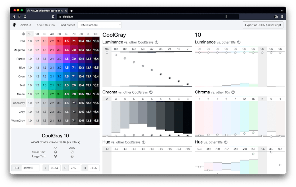
CIELab.io is a color tool based on human perception. CIELab.io lets you work with colors based on human perception, instead of based on how screens display them.
It’s open source (see the cielab.io GitHub repo), and comes with some popular color-system presets, such as the one for IBM’s Carbon Design System (seen in the screenshot, below).
See also ColorCube, a color accessibility checker built by Ooomph.
6.5 Contrast Ratio
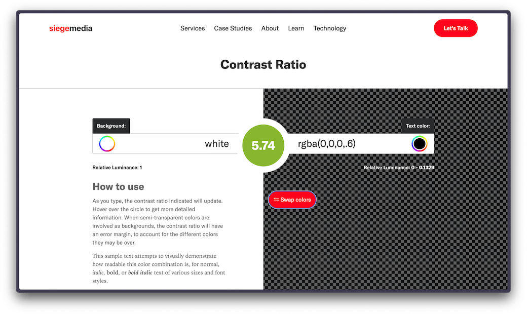
As Lea Verou, the maker of Contrast Ratio, describes in her article on the raison d’être behind the tool (Easy color contrast ratios), the abundance of WCAG color-combination checkers out there have some shortcomings. The one I encounter most often has to do with transparency. A lot of frameworks use rgba() colors that fail when I run the page through an accessibility checker, and I want to figure out how much I need to adjust the alpha to bring it up to muster. As Contrast Ratio accepts any CSS color the browser does, it lets me accomplish this!
For more on the methodology and other features, be sure to read Easy color contrast ratios.
I, for one, discovered that my primary link color was passing WCAG 2.1 requirements with flying colors, but had too low of a contrast against the background for its use as body text when using APCA.↩︎